
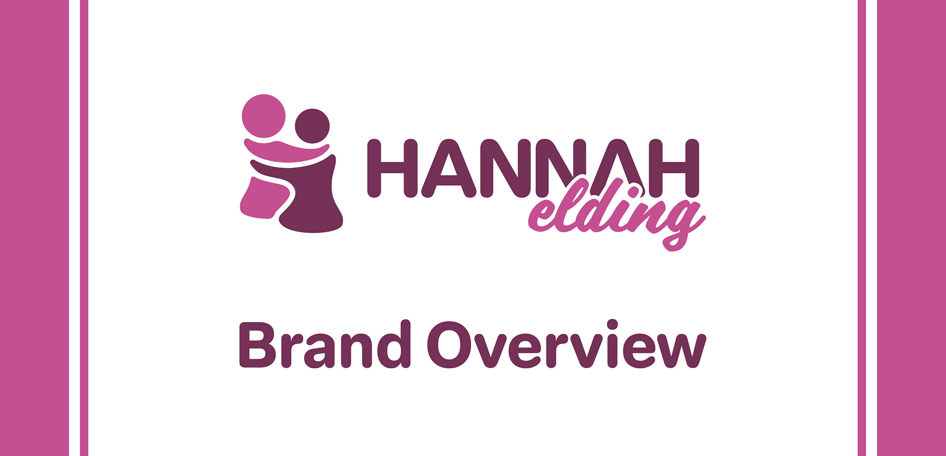
This logo and branding was built to represent the personal brand of Hannah Elding. The visual style is pulled from preliminary research, including an interview. The logo uses bubbly, rounded shapes in both the picture mark and the type, and the curvature along with the shades of pink and purple give a classic feminine feel to the logo.
The picture itself is an abstracted visualization of two people embracing each other. This image exemplifies connection and kindness. The hand-drawn rendering of the logo connects to the idea of growth and gives it an organic and home-grown feel. The shape of the picture is also reminiscent of the letter H, which further strengthens its connection to the brand name.
In order to align with the comfy curves of the picture mark, the word-mark uses two typefaces that both include characteristics of the picture mark. The primary typeface for the word HANNAH is Elza Round Bold. Elza is a simple sans-serif typeface with a professional feel, and the rounded tips of the letters give it a cutesy feel. The secondary typeface for the word elding is Scriptorama JF. It has a calligraphic style that contrasts the primary type, while still holding organic elements to connect to the brand. It has a heavier weight than many calligraphic typefaces, which allows it to remain legible at a variety of sizes.
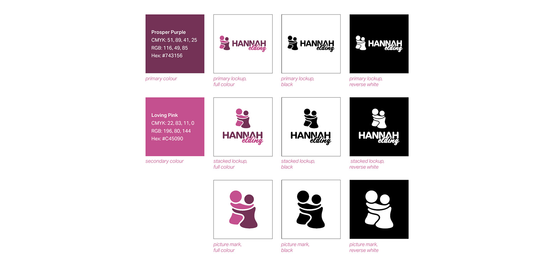
Brand colours and different logo lockups.
This branding includes 3 different logo lockups, with each available in black and reversed white in order to be used in a variety of scenarios. Two brand colours were determined to be used across the branding.
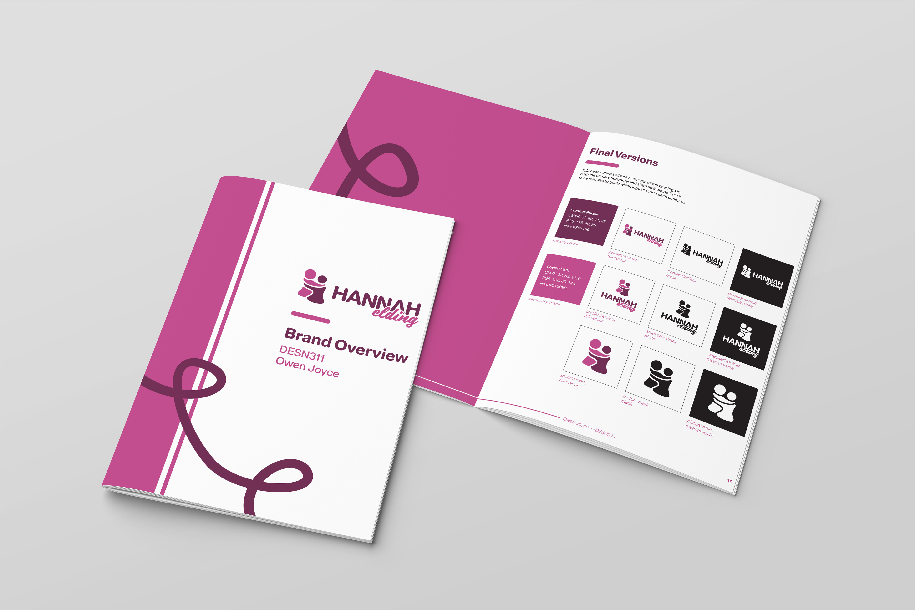
3-dimensional mockup of the printed brand overview.